15 Good UI Examples from SaaS Businesses and Mobile Apps
A good user experience starts with a user-friendly UI. This helps users navigate and get value from your product in the most frictionless way possible. What are the best practices to follow in UI design that lead to great user engagement and experience?
This article looks at 15 good UI examples to help improve your product.
TL;DR
- UI design focuses on a product’s visual UI elements and aesthetics, such as buttons, icons, and layouts.
- UX design is concerned with the overall feel and functionality, ensuring the user’s intuitive and satisfying interaction.
- Great UI design examples should be simple, communicate with the users, provide guidance, be aesthetically pleasing, and balance aesthetics and usability.
- Userpilot uses pre-loaders and white-space elements to provide feedback to the users when the app is loading.
- Asana uses gamification to engage users and encourage them to continue to use your product.
- Notion’s onboarding screen uses a blank state UI design to showcase its product.
- Kontentino’s welcome screen uses a modal to present an inviting message to new users of their SaaS.
- Figma presents helpful tips to highlight important aspects of their product.
- Medium’s web elements use minimum color and well-chosen typography to provide a great user experience.
- Mailchimp optimizes the design space so users get clear and relevant information on how to take action.
- Duolingo combines gamification and responsive design elements in its user interface design that hook users to use its app.
- Spotify uses different color palettes for user interfaces to portray relevant emotions or highlight specific design elements.
- Cognito utilizes an animated design on its homepage to demonstrate what it does.
- Dribbble has a great UI design by arranging content into a card design, making it easy for users to consume.
- Current UI designers chose bold color palettes to resonate with their target user base.
- Squarespace uses a carousel so users can quickly scan templates and find what they’re looking for.
- WeTransfer’s landing page design uses microscopy and an easy-to-read font to draw users who land on the site.
- Airtable uses a clear CTA to prompt users to take action and places key design elements where users can easily interact with them.
UI design vs UX design
Though closely related, User Interface (UI) and User Experience (UX) design serve distinct roles. UX design delves into understanding user needs, ensuring a seamless and intuitive experience. It’s about the overall feel and functionality.
On the other hand, UI design focuses on the product’s visual aspects, from layout and color schemes to interactive elements. It aims to create visually appealing and user-friendly interfaces.
In essence, UX design shapes the user’s journey, while UI design refines the visual touchpoints.
How to create great user interface design elements
If you want to create a great user interface, there are specific considerations and design skills you need to think about.
- Keep it simple: Users should be able to grasp the purpose of the interface immediately. Overcomplicating things can lead to confusion and frustration. A clean, straightforward design ensures users interact and navigate with ease.
- Communicate with users: An effective interface communicates clearly with its users with descriptive texts, engaging animations, and color changes to indicate actions or statuses. These components work together to provide clarity and reduce the learning curve.
- Offer guidance throughout: Whether through tooltips, onboarding tutorials, or clear call-to-action buttons, guiding users through the interface ensures they feel supported and can use the platform efficiently.
- Implement intuitive design elements: Elements should function naturally to the user. Familiar patterns and layouts can help users feel at home, even when interacting with a new interface.
- Make it aesthetically appealing: A visually pleasing interface can enhance user satisfaction and make the experience more enjoyable. Cohesive color schemes, consistent typography, and well-thought-out layouts enhance an interface’s visual appeal.
- Strike the right balance: While an interface should be visually captivating, it shouldn’t compromise on its primary function: usability. Striking this balance ensures that users have a beautiful and functional interface.
15 Good UI examples to inspire you
Seeing good UI design can help you decide what is right for your product and help spark some inspiration if you are stuck wondering how your user interface design should look. These are 15 favorite UI design examples to get you started.
1. Userpilot’s pre-loader and white space UI design
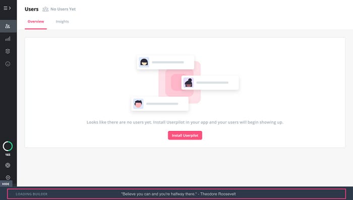
Instead of seeing it as an empty void when users first load your app while it’s working, using a pre-loader as a UI design helps the user understand something is loading.
For example, the UI designer of Userpilot uses a loading bar and white space design to show the user what action they should take next, and the app is working on the next step.
Combining both user interface elements helps keep the user engaged and prevents users from churning due to no user feedback.
2. Asana’s celebratory unicorn
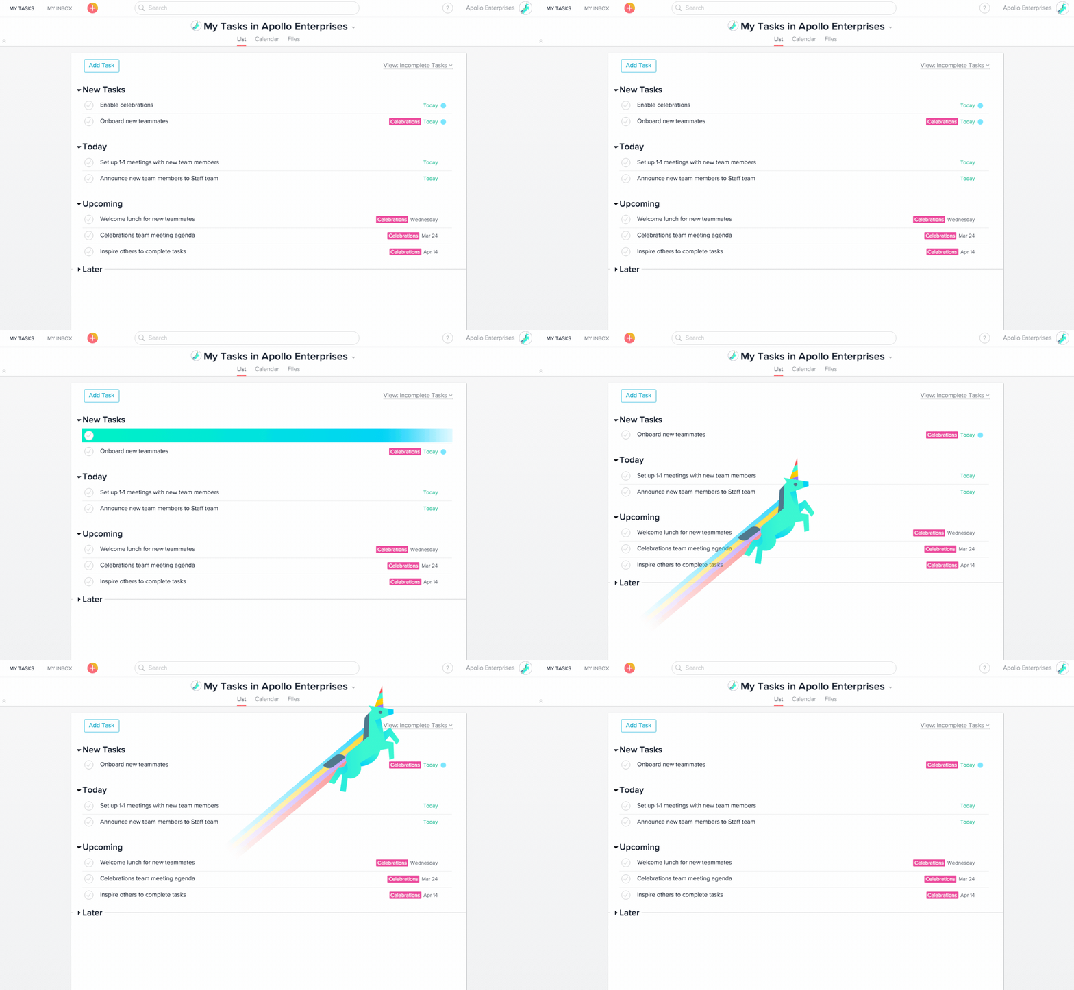
As you complete tasks and hit milestones, the UI designer of Asana rewards you with a whimsical animation of a unicorn. It’s a playful nod to gaming, where visual fanfare often celebrates achievements.
Gamification UI design encourages you to interact more with the platform, increasing user engagement.
3. Notion’s onboarding screen
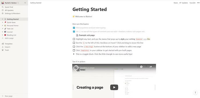
Notion’s UI designer uses a blank slate for its onboarding screen, offering a minimalist screen where users can interact and learn how to use its product and watch a video tutorial.
By presenting a clean UI design, users aren’t bombarded with too much information at once, and it provides subtle guidance on how to start.
4. Kontentino’s welcome screen
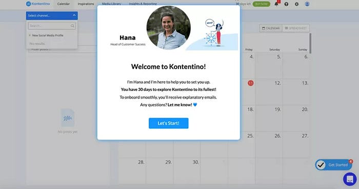
Kontentino uses a modal as part of the UI design of its welcome screen. It offers a friendly welcome to new users, using a smiley face and positive message to make them welcome.
A model helps to grab the user’s attention when you want to deliver important information you want users to read. It also helps to foster a connection using a welcome message like Kontentino.
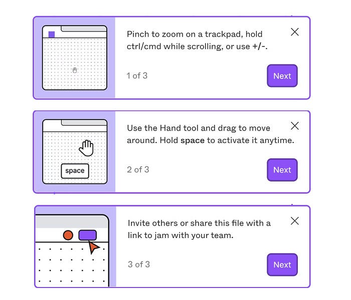
5. Figma’s helpful tips
Figma uses popups as a helpful UI design to assist users in important guidance in using the product and shortcuts that will make life easier when interacting.
These tips ensure users don’t get stuck when starting on your product and are placed strategically so they don’t interrupt the users in what they are trying to do.
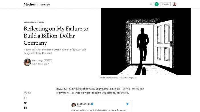
6. Medium’s web UI example
Medium’s UI designer uses a minimalistic design with a low color scheme, generous line spacing, and well-chosen typography, focusing only on digital publishing.
This UI design uses a pristine white canvas to avoid distractions so readers can focus solely on the words.
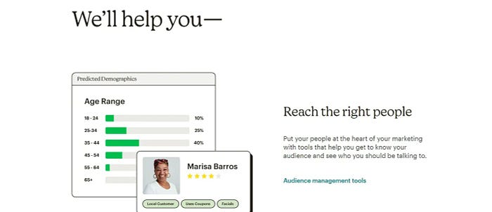
7. Mailchimp’s UI example focusing on usability
Mailchimp’s UI designer maximizes the usability of space in its UI design. Information is neatly organized on one side, paired with real-time images.
It also uses a clear CTA to beckon users to dive in and use the platform.
By dividing the screen, Mailchimp ensures users can access information and see its application simultaneously, reducing the cognitive load.
Real-time images in this UI design show the tool in action and provide a sense of trust and transparency.
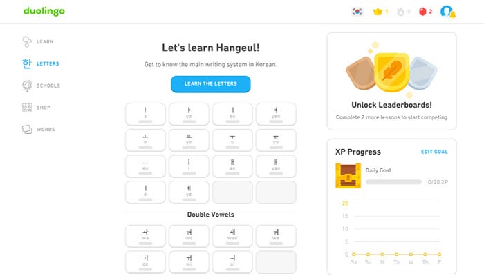
8. Duolingo’s gamified and responsive UI design
Duolingo uses engaging graphics, progress bars, and achievement badges in this UI design to gamify its app.
Whether on a desktop, tablet, or smartphone, the interface adjusts beautifully, ensuring a consistent and enjoyable learning experience.
Duolingo turns the learning process into a game, motivating you to earn points, level up, and keep that daily streak going.
And no matter the device, Duolingo’s responsive UI design ensures the platform looks and feels just right, making it easy to learn on the go.
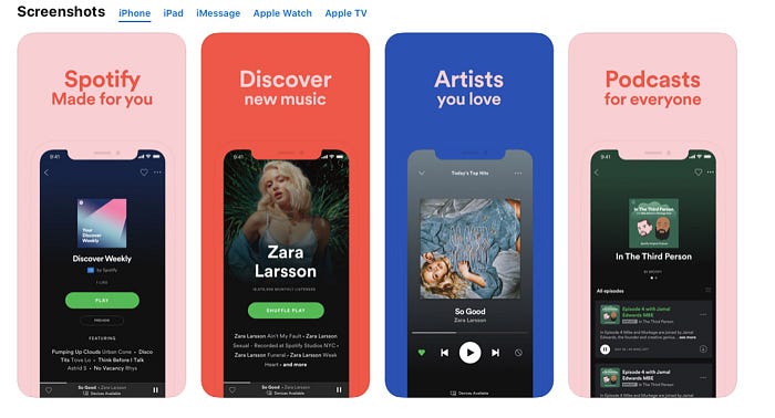
9. Spotify’s color palette for different user interfaces
Spotify’s UI designer used vibrant color palettes to highlight specific design elements and set the mood for your musical exploration.
The color gradients can evoke specific feelings to enhance the user’s connection to the music and the app.
The gradients in this UI design draw attention to particular design elements, ensuring that key features stand out and are easily accessible.
10. Cognito’s animated graphic design
Cognito is a great example of using animated graphic UI design to simplify its offering to customers when they land on its website home page.
The animated graphics capture attention instantly, engaging users from the moment they land on the site.
The combination of motion and text provides a dynamic way to convey Cognito’s value proposition, making it easier for users to understand their services.
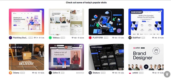
11. Dribbble’s great UI design
Dribbble’s UI designer uses a series of cards for its UI design, each highlighting a design project. These cards offer a snapshot, enticing you to click and explore further.
The layout is clean, with each card providing enough information to pique your interest. And you can use the search bar to find the UI designs you want easily.
The card-based design organizes content in a digestible manner, making it easy for users to browse and discover.
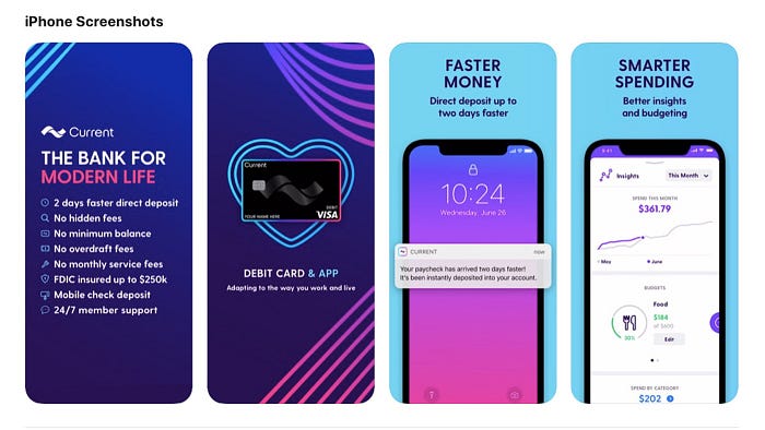
12. Current’s color palette
Current uses bright colors with trendy fonts to appeal to their target audience of the younger demographic. Every element, from the backgrounds to the icons, is designed to resonate with the younger demographic.
By merging vibrant design with financial education, Current challenges the traditional perception of finance, making it more relatable and less intimidating for its target audience.
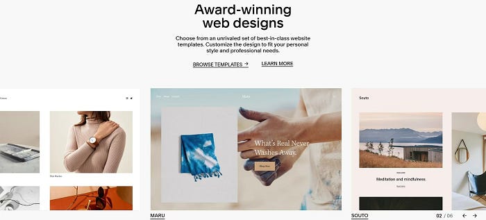
13. Squarespace’s template carousel
Squarespace uses a carousel to display various templates within their app. As you navigate, arrows guide you from one card to the next, creating a familiar design cue that ensures ease of use.
A minimal copy accompanies each card, and a central navigation system keeps you oriented, showing your progression through the available templates.
The carousel format allows users to quickly scan multiple templates, finding the perfect fit for their needs.
14. WeTransfer’s landing page design
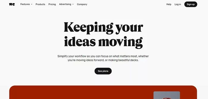
WeTransfer creates a landing page web design that is clear and concise. It uses a straightforward microcopy and an easily readable font that immediately engages site visitors.
A prominent black CTA button guides you directly to the pricing page, streamlining the journey for prospects to find the ideal plan.
The simple and concise copy ensures visitors grasp WeTransfer’s offerings without confusion.
15. Airtable’s tips for new users
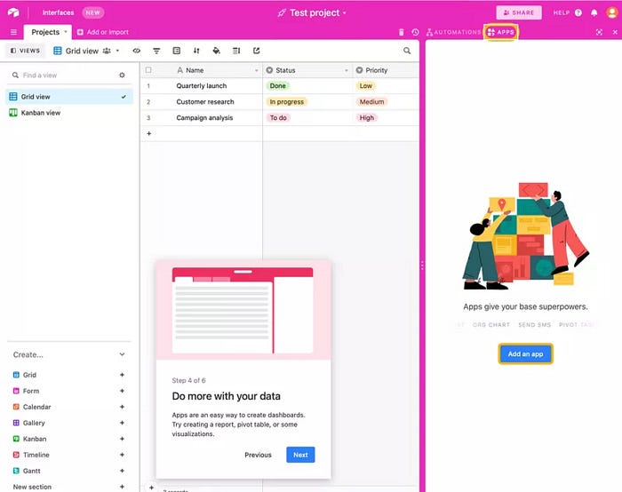
Airtable can be a complex app for new starters, so it provides users with helpful tips to prevent them from being overwhelmed.
The tips aren’t intrusive; they blend seamlessly into your exploration, ensuring you get the most out of the platform without feeling lost.
Airtable’s helpful tips act as a virtual guide, ensuring new users understand the platform’s capabilities step by step.
Users feel more confident navigating the platform and utilizing its features by providing timely advice, tools, and insights.
Conclusion
As showcased by the 15 UI design examples, a harmonious blend of aesthetics, functionality, and user-centricity makes a design stand out. These UI design examples are a testament to the power of innovative web design in enhancing user engagement, retention, and overall satisfaction.
However, it’s essential to remember that while a captivating user interface can draw users in, sustained growth requires a holistic approach.
Beyond the initial interaction lies product growth, where user engagement, retention strategies, and continuous improvement play pivotal roles. A stellar user interface is just the beginning; the product evolution and growth are ongoing.
So, once you’ve nailed down an impeccable UI, don’t rest on your laurels. Think about the bigger picture of product growth. If you’re looking for guidance on this front, Userpilot is here to assist. Dive deeper into what Userpilot can offer and take the next step in your product’s journey by booking a demo.
