4 Ways to Personalize Your User Onboarding Experience
At the heart of a great product user onboarding experience is user success.
Your product solves a problem for your user. They hire your product to solve that problem for them. An effective onboarding flow helps them successfully solve that problem with your product.
To design an onboarding experience is to understand the user and their problem. That way we can align the product experience with their personal success. This will also help us create clear paths through the product and avoid friction points.
Personalize User Onboarding by User Role
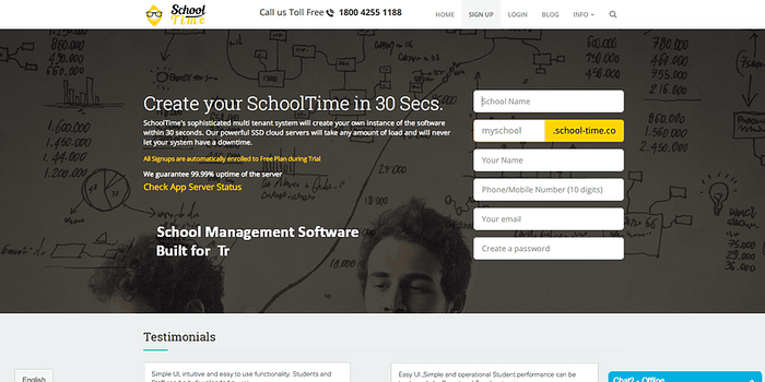
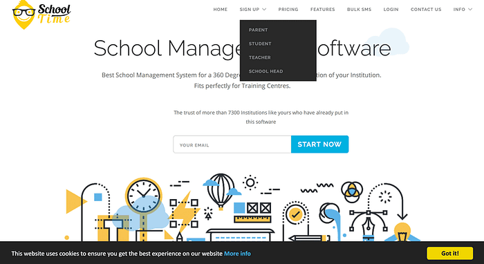
A few years ago, I worked with School Time — a brilliant product for private schools and colleges. A single system serves four different types of users: Teachers, Students, Parents, and Administrative staff. The value for each user group is quite different, though.
Initial sign up flow was designed around speed. The founders wanted to communicate that it was easy and quick to get started. On the other side, this failed to segregate new sign-ups by user role. New registrants landed on the same start screen, regardless of their role.

This created a lot of confusion. Each user type would need to begin the product journey from a different entry point. One that was relevant to their role.
Conversion rates were low. Extensive customer support was the norm, and most users would ask for manual initial set up.
Contrast this with a new sign up flow, where each user type is set on a personal flow from before they sign up.

By personalizing onboarding experience to the user type, we can make it more relevant and goal-oriented.
Personalize User Onboarding by User State
New and existing users are two separate groups. A brand new sign up is on the path of discovering that first value your product promised to deliver. While an existing user is familiar with the product and is looking for repeatable value.
This requires different messaging content and channels, depending on the user state.
New users are generally less receptive to in-app walkthroughs. In fact, over 70% will dismiss an in-app guide right away. Of these only, about 6% will make it to the sixth step.
Short, actionable tips and pointers help newcomers best. Ones that quickly help to progress to the Aha! moment, the first time your product can deliver its promised value.
Existing users that rely on your product are more receptive to longer content. Particularly, when you onboard them to a feature that has changed.
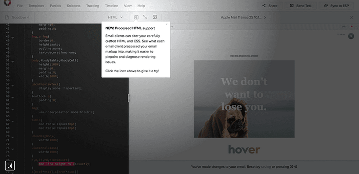
Litmus — an HTML email proofing service — saw 62% of existing users adopt a new feature having seen an in-app tooltip. That’s compared to just 2% adoption among those who haven’t.

More Ways To Personalize User Onboarding…
Read the full guide on the Userpilot blog: 4 Ways to Personalize User Onboarding
