8 A/B Testing Examples For Product Growth
Find inspiration in these A/B testing examples to improve your product.
This testing method involves putting two versions to the test. This allows you to gather user insights and achieve statistically significant results. Then, implement the version with better performance. For instance, the one with a higher conversion rate or click-through rate.
In this article, we compile eight A/B testing case studies from big companies such as Spotify and Instagram. See how they do it and borrow ideas to improve your product engagement.
TL;DR
- A/B testing is essentially a research method that compares an original version and a variant (A and B). Its goal is to determine which version your users like the most. You can use this to test web page copy, button placement, the name of a feature, or a call-to-action (CTA).
- You should conduct A/B tests when:
- Optimizing elements such as product images or layouts.
- Making changes to improve user engagement like editing an email subject line, a button’s design, or CTA copy.
- Adjusting elements to boost product conversion such as modifying the pricing structure.
- Doing feature test variations such as writing different variations for a feature name. - Examples of A/B testing include:
- Userpilot for testing different in-app messages for upselling users.
- Spotify for analyzing the placement of the Dolby Atmos feature.
- Apple Music for testing the transfer feature using SongShift.
- Instagram for conducting a test for two features on its home page.
- YouTube for identifying which variant reaches conversion goals when limiting access to videos.
- Channel 4 for analyzing autoplay length on videos in its on-demand platform.
- quip to identify the best product page design to gain valuable insights and increase revenue. - Make changes to your in-app copy, add-ons, onboarding checklists, product documentation, and more. Plus, use the same platform to track how the different variants perform with Userpilot. Get a demo.
What is A/B testing?
A/B testing, also known as a split test, is a testing method that compares two versions of a product, feature, copy, or web page. The goal is to define which one has a higher conversion rate. It works by having a control version (A) and a variant (B) and showing each to half of your target audience.
For example, let’s say you’re A/B testing for product management. You have two different versions of the chatbot’s opening message and don’t know which one to choose. Do a test run to see which one resonates the most and analyze user behavior.
When should you A/B test?
You should A/B test whenever you’re looking to identify which of your options have better results.
Usually, people use this research method when they need to:
- Optimize elements. Modify current elements to get a better user response. For example, updating product images, icon design, or layouts.
- Improve user engagement. Test different options and stick with the one with higher engagement. For instance, test email subject lines, button designs, CTA copy, or landing page copy.
- Conversion rate optimization. Test alternatives to find which will increase revenue and bring in more conversions. For example, test changing your pricing structure from annually to monthly. You could also try to update your freemium offering or paid ad copy for your marketing campaign. Take a look at these pricing page best practices.
- Offer better features. Conduct a product feature analysis before running tests to define whether or not users enjoy certain functionality before actually developing it. For example, trying out names or adding buttons for new features to evaluate its click-through rate.
Avoid A/B testing mistakes by using this research method to evaluate only two versions. If you’re still crafting your website copy or if you want to gain a deeper understanding of your customers, you may benefit from other options, such as a multivariate test. There, you can test the changes for multiple page variables at once.
8 A/B testing examples to inspire your future tests
We’ve compiled seven A/B testing examples from big companies to spark your inspiration. Make sure to collect the A/B testing metrics that make sense for the target audience.
Let’s explore these in detail:
1. A/B test in-app messages with Userpilot
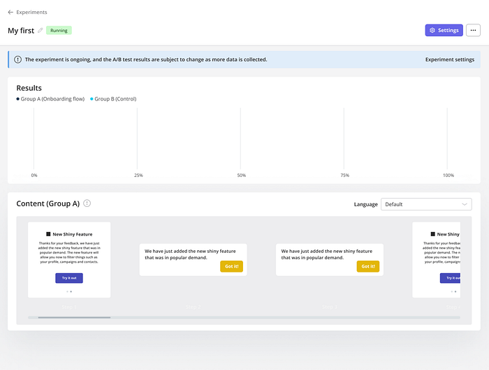
Userpilot is a no-code, all-in-one product adoption platform for teams focused on product-led growth. You can use Userpilot to test in-app messages and flows. For example, you can test two different versions of an upselling prompt that appeared as an in-app message during the onboarding.
The first one can be a gif demonstrating the added value of the premium feature; the variation includes a preview of a micro-video.
How does it work?
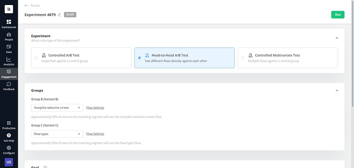
In this case, Userpilot allows you to choose between a controlled A/B test, head-to-head A/B tests, or multivariate testing.
Each option drives different results, as multivariate testing and A/B testing are different methods. The first one tests multiple versions and changes at the same time, while A/B tests focus on the impact of a single change.

After conducting the study, we were able to identify which options drove better user engagement and matched our conversion rate optimization (CRO) model. In this case, version B had a better response than the original version of the prompt. It also had better conversion rates than the control group.
2. Spotify A/B tests Dolby Atmos on their web app
Spotify is a music, video, and podcast streaming platform. Like all the other big companies, it frequently tests features on its current user base and website visitors.
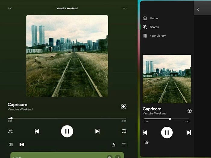
In this example, a user reported seeing the Dolby Atmos logo on Spotify’s iPad and web app. Since this isn’t available for all users, we can assume that Spotify is testing where the best place to set the Dolby Atmos logo is based on user behavior.
How does it work?
The user reported that the logo only appeared in the full-screen view. It wasn’t available from the sidebar view — or on all songs.
At the time of writing, this is likely still in testing as there’s no official feature release from the Spotify team. We don’t have information about the sample size for this test or the date Spotify will announce the integration.
3. A/B test music transfer feature in Apple Music
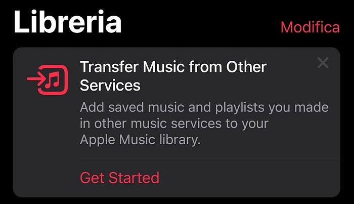
Apple Music is a music streaming platform with zero ads. It seems to be A/B testing a new feature for Android users. According to Reddit users, this functionality allows users to bring in their saved music and playlists from other platforms.
Apple Music does this through an integration with SongShift, a third-party tool that moves user data from one streaming service to another.
How does it work?
We assume this is part of an A/B testing strategy because the feature isn’t live on the platform yet.
Apple Music will need to review the statistically significant results and determine where is the best place to add the feature notification — or determine which copy to use. We have no information about how Apple Music is segmenting A/B tests or when it’ll make an announcement.
4. Instagram A/B tests unskippable ads

Instagram is one of Meta’s social media apps. It has confirmed that they’re testing a new feature for unskippable ads.
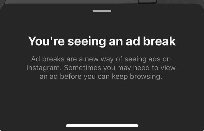
Some users have reported seeing a countdown on their feeds as they’re scrolling through Instagram. The button includes an information bubble that says:
“You’re seeing an ad break. Ad breaks are a new way of seeing ads on Instagram. Sometimes you may need to view an ad before you keep browsing.”
How does it work?

We’ve seen pictures of the ad break button with both a timer and a pause icon in the middle of the circle. This indicates that Instagram is trying to see which design resonates the most as part of an A/B testing process.
While this isn’t live yet, users seem displeased with this new feature. They share on Reddit that they close the app every time they see the ad break button come up.
5. A/B testing swiping up to view stories on Instagram
Our editor experienced this herself back in February. We confirmed this was part of a test from the Instagram team, according to discussion among Reddit users.
The users were viewing Stories on Instagram when they experienced a new instruction: swipe up instead of swiping left on Stories. This is a big change because Stories follow a horizontal progression. However, with this test, users would see them vertically, as if they were looking at Reels.
How does it work?
This variation explored which version users liked the most: swiping left or up on Stories. This UX change borrows UX mental models from TikTok or Reels, where users have a swiping-up habit.
Our editor shares: “I have two Instagram accounts logged in on the same device, one had the change implemented and one didn’t.”
We believe this change didn’t stick through because users still swipe left to watch the next story. We guess this could’ve happened because the A/B test results were unsatisfactory with a low user adoption rate on the variation.
6. YouTube A/B test limiting logged-out access to its videos
YouTube is a video-sharing app. It’s supposedly split-testing a new functionality that asks users to sign in to watch content.
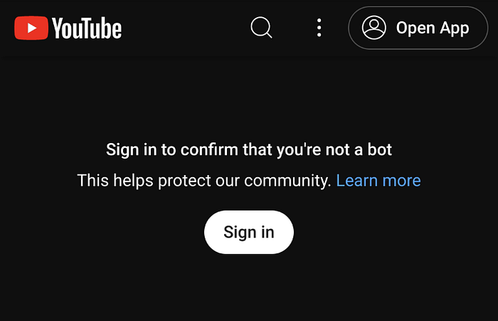
Some users are being prompted with this message: “Sign in to confirm you’re not a bot. This helps protect our community. Learn more.”
How does it work?
With this example, YouTube is trying to determine what happens when users are prompted with that message. It appears to be an A/B test and not a bug or bot-detection plan because it affects any network with big traffic, like cloud providers or public VPNs.
We still don’t know the A/B test results, as YouTube hasn’t made any announcements.
7. Channel 4 tests different autoplay lengths for its video
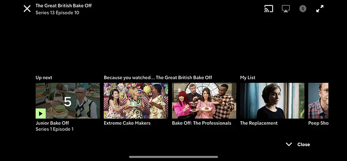
Channel 4 is a British national television broadcaster and streaming service. This company wanted to understand visitor behavior and improve the on-demand offering for its target audience. The channel wanted to test alternatives and minimize the costs and risk of launching new features, so it conducted an autoplay experiment.
How does it work?
Channel 4 believed that reducing the time it took to automatically play the next episode would keep users more engaged. So, it ran a split test that put different countdown lengths to a test.
The study was a success as statistical significance showed that the best option was one the company believed to be shorter than expected. This ended up removing friction between episodes.
8. Quip A/B tests its product page design
quip is a New York-based company that designs personal oral care products and offers tailored services for its users. You can access its services through a website or mobile app.
One of Quip’s most popular products is the electric toothbrush, which comes with a subscription for refills for toothbrush heads.
How does it work?
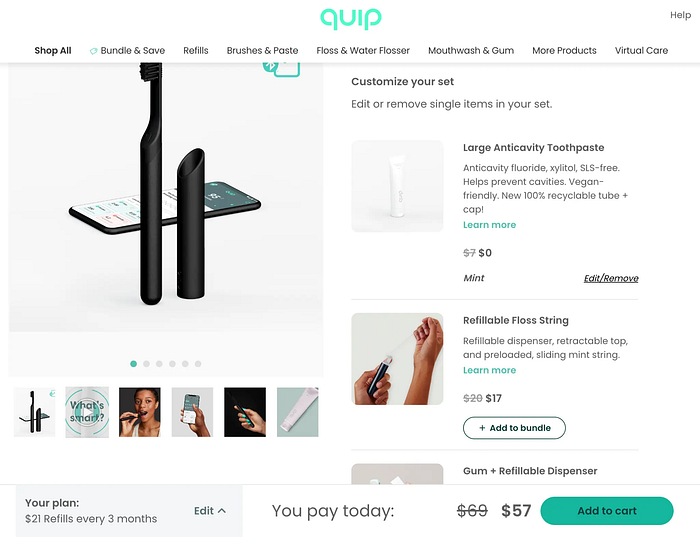
The team tested a variation for its current product offering view before the checkout. There, users could choose the type of subscription they wanted to get for the refills. The original version included a drop-down menu at the bottom left, while the other presented the options on-screen.

The new variant got higher conversion rates and more purchases per transaction.
Conclusion
The goal of an A/B test is to collect data to inform decisions and build better products. By looking at these examples, you can see that your current version can always be put to the test. This allows you to determine which is the best possible option to get more conversions.
If you’re looking to implement A/B testing in your business, increase sign-ups, and increase user engagement, try Userpilot. This no-code, all-in-one solution lets you plan your tests and review test results in the same app without having to install a pixel for Google Analytics. Get a demo.
